ShopDreamUp AI ArtDreamUp
Deviation Actions


Suggested Deviants


Suggested Collections


Description
DOWNLOAD THE FILE TO SEE THE WHOEL THING!!
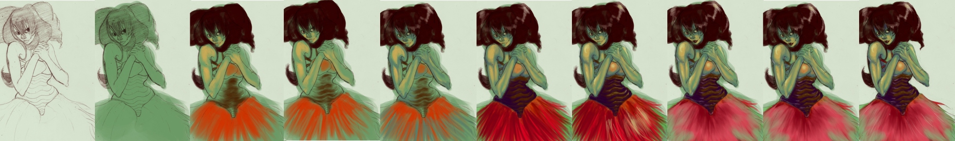
This is a character that I created. Her name is "Boshaft"...which I believe means mischievous in SOME language, but I forget. This character is the reason why you always seem to lose your keys, your extra sock, your coins or anything else that you seem to misplace. She loves to take things from humans because she finds them to be very interesting beings and she constantly tries to figure them out. She has abnormally long arms that allow her to quickly grab whatever she desires. her hair and her dress both male her seem like a really colorful dust-bunny to the human eye.
That being said, on with my process of painting this-one of my favorite characters.
Step 1:
I start out with a sketch of Boshaft. I've never been one to create "line art". For whatever reason, I can draw in pen, but I cannot draw over my penciled lines with pen and still get the same organic feel that i get with pencil. I make sure that the drawing is some-what clean before scanning it in....and if it's not-I wouldn't mind. I enjoy a little chaos when it comes to art. LOL.
Now, I've been using GIMP for...a day. LOL. I downloaded it because I'm going to change over to a Mac (BTW, buy a mac and an ipod NOW, they're essentially giving away free Ipod Touches!) and the program that I love and use quite often, Open Canvas, is not available on Mac. So I looked into both Art Rage and GIMP and GIMP actually wasn't a bunch of hype as I thought it would be and it turned out to be a really good program that does every thing that I need and want-as far as my art goes now.
Anywho, so I played around with the levels on the black and white sketch and gave the sketch a nice dark reddish brown color and the background a nice light green color. I did this because I feel Boshaft has a nice greenish personality. Not only that, but red and green are complimentary colors!
Step 2.
Now that tinkering with the line art is done, I decided to make a new layer and put it under the line art layer and change the lineart layer to "multiply". This allows me to basically color in the lines like a coloring book...but not. LOL.
I like to fill up the majority of the line art with a color that I believe will be the color that I shade with. That usually changes depending on the object, but I do it anyways. I don't worry about going out of the lines (my 1st grade teacher would kill me) because I figure that I can always go back and erase it. no only that but I've always HATED coloring so neatly. LOL.
Step 3
Now I start adding in what are essentially base colors. I black in the hair, color the top a little and start on the dress. While I'm doing this, I keep in mind the light source and I only paint the areas where I believe that the actual color of the object would be exposed to light. I used to do things almost completely different. used to go straight from line art to base colors, to shadow to highlight, but I realized that doing things this way allows me to have that colored undertone that I enjoy so much in my art.
Step 4
Now that I've gotten some-what of an idea of where I want the light to hit, I take the same color that I used in step 2 for the shadow color and I go back and start reestablishing the shades and going into deeper, more intricate areas and "shading" them.
Step 5
At this point, I believe that the green shading isn't quite doing it for me as much as I want it to. So I take a blueish color (which is a darker value than the green that I used) and start shading that in the areas that I believe will be the darkest.
Step 6
The blue STILL doesn't quite do it for me, so I pic a purple color (which is a darker value than blue) and I start shading in where i believe things will be even DARKER. At this point, I pay special attention to the top and the dress and try to see what works. I'm pretty secure with the top after I changed the upper area to a lighter value, but the skirt still bothers me a little.
Step 7
I'm pretty happy with what I have here, but I really want it to pop a little more. So here is where I add the highlights. I take a light yellow color and I start to highlight where i believe it's necessary. At this point, I start adding some God-awful highlights to the skirt and the lower part of the top. At this point, i'm a little annoyed and I'm cringing a little, but I figure that it'll get better nd I'll figure something out eventually.
Step 8
Before I do anything in this step, I get rid of the entire feel of the skirt and I replace it with a light more desaturated red and green. Her skirt is supposed to look like some sort of dusty straw-like material that's had red and green paint slowly bled into it...if that makes any sense.
After I do that, I start adding in some "reflections". Basically it's supposed to be light refracted from another object onto her. LOL. I do -suck- at lighting, but....whatever. LOL. I pick a light pink color and I go into the areas where there are shadows and I put a little areas that are pointing towards the floor.
I also, at the last second realize that she's supposed to have black lips, and I take care of that right away.
Step 9
This is part was basically a "last call" situation. I Added some very miniscule changes and add deeper highlights and shadows where i feel they're needed.
Step 10
The final step-yay! So right here, I go back and I erase anythign out of the lines, do a quick look over to see what think needs to be better and such. I define the muscles in her arms a little more, I add some white streaks in her dress, I add a light more highlights here and there, I erase the edges around the hair and I think I'm DONE.
And now, I have something that is pleasing to me. The image has the mood I want it to have and the attitude that I want Boshaft to have.
So that's my painting process!! I've only been using GIMP for a day and i must say, I'm pretty happy with it and I look foreword to using it on my mac.
Now for Gaia purposes, I'd like to know what you think of the painting process. Somethings that you would do differently?
Image size
1962x290px 286.15 KB
© 2008 - 2024 AmourFonce
Comments10
Join the community to add your comment. Already a deviant? Log In
Hi... please help when Im designing a winamp skin on gimp.... what is the pink line that separates the buttons... and how do I handle it... please reply at sithembiso.mkhize@gmail.com